How to automatically book regular clients into new openings
If you run classes that fill up with the same faces every week, you already know the drill: the schedule opens, and you (or your client) has to remember to jump in and book the same spot, week after week. Miss that window and a regular client can lose their place to someone else entirely.
The Regulars feature in Clovo fixes that. It lets you attach a client to a class permanently, so every time a new class opening is created, Clovo automatically books them in — no reminders, no race to the booking button, no manual admin on your end.
What counts as a regular
Regulars are for clients who attend the exact same class, on the exact same schedule, every time it runs. Think of it as a standing reservation.
A few things worth knowing before you set one up:
- The class schedule needs to be saved and active first.
- You can’t add regulars to a one-off (popup) class.
- Regulars must have a plan that includes the class on the schedule before they can be added as a regular.
- A regular is tied to the client’s account, not one of their individual profiles – i.e. a client’s family member can’t be added as a regular without their own account.
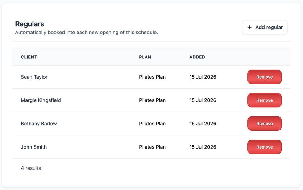
The schedule page shows you exactly who’s set as a regular, which membership is paying for their spot, and when they were added.
Adding a regular
From the saved schedule page:
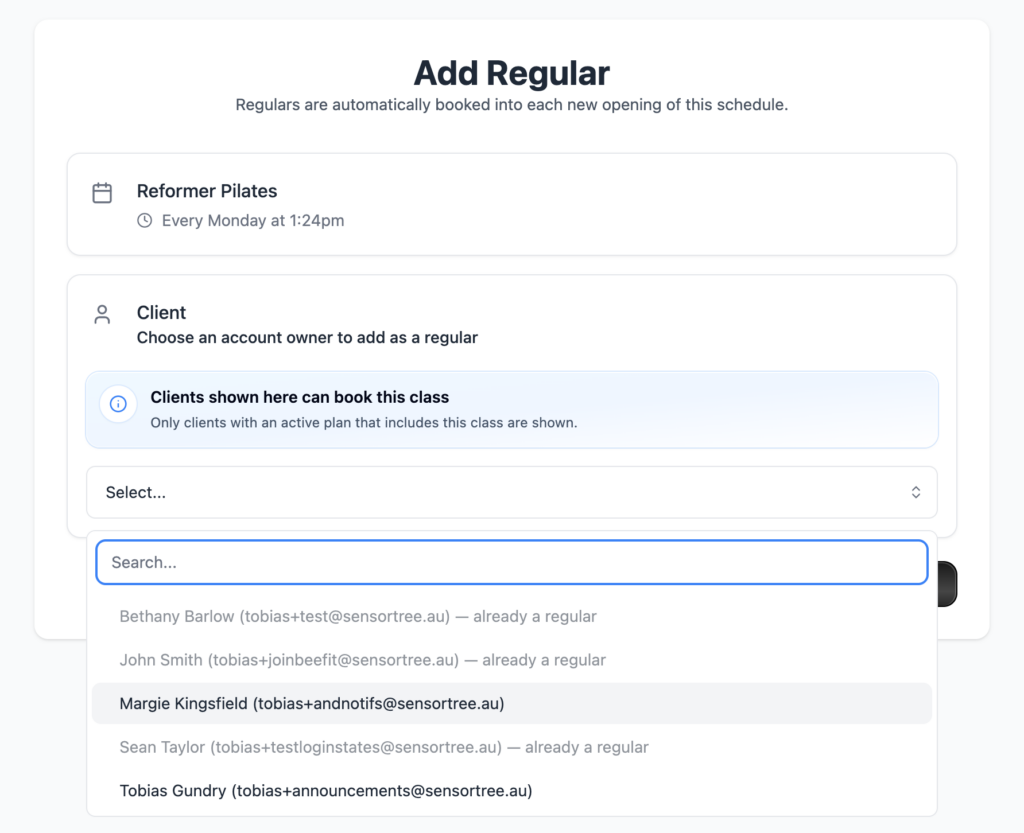
- Select Add regular.
- Choose the client from the list. Only client account owners with an active plan that covers this class will show up here.
- Choose which of the client’s active memberships should be used to pay for the automatic bookings.
- Select Add Regular to confirm.
A couple of things to keep in mind:
The membership you choose sticks. Clovo won’t automatically swap to a different plan if the one you picked stops being usable — say it expires or gets paused. If your client changes membership, remove them as a regular and re-add them with the new plan.
It only applies going forward. Adding someone as a regular doesn’t fill them into classes that have already been scheduled. If there are existing openings they should be in, you’ll still need to book those manually.
Removing a regular
Select Remove next to the client’s name on the schedule page and confirm.
This stops any future automatic bookings, but it won’t touch or cancel anything that’s already been booked. Existing bookings are handled through your normal cancellation and refund process, just like any other booking.

If a client is archived or their account is deleted, they’re automatically taken off every regulars list they were on. Their booking history is kept as normal.
How automatic bookings work
Every time the schedule generates a new class opening, Clovo works through the regulars list — in the order they were added — and tries to book each one in using the membership selected for them.
Being a regular means your client skips the usual priority booking window and gets first access to the spot. It doesn’t, however, skip the normal rules that keep bookings fair and accurate. Capacity limits, membership status, pauses, expiry dates, and available credits are all still checked for every booking.
If a class is full by the time it gets to a later regular on the list, that attempt is recorded as a failed booking — same as it would be for a normal booking that couldn’t go ahead. Nothing about the opening or the successful bookings around it is affected.
If a booking doesn’t succeed for one class, that’s a one-off — your client stays on the regulars list and Clovo will try again automatically for the next opening.
What your clients will see
When a regular booking goes through, your client gets the same booking confirmation email as any other booking, and any after-booking message you’ve set up for the class still fires as normal.
Adding or removing someone as a regular doesn’t send them a notification directly — so if it’s worth telling your client, that’s a conversation to have yourself.
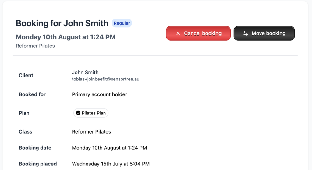
Bookings made this way are marked with a Regular badge in your booking tables, so your staff can always see at a glance how a booking came about.
Checking on your regulars
To keep staff activity easy to scan, regular bookings don’t clutter your feed with individual entries. Instead, you’ll see one combined Regulars Booked item each time a new class opening books its regulars in, along with Regular Added and Regular Removed entries whenever the list itself changes.
If something didn’t go to plan for one of your regulars, the failed booking is always there to check — open the class occurrence, the client’s membership, or the failed booking record itself to see exactly why.